Build Models in your Browser
Use Insight Maker to create rich pictures and causal loop diagrams. Then make shareable simulation models. All right in your browser, for free. Just sign up for a free account and start modeling now.
Use Insight Maker to create rich pictures and causal loop diagrams. Then make shareable simulation models. All right in your browser, for free. Just sign up for a free account and start modeling now.
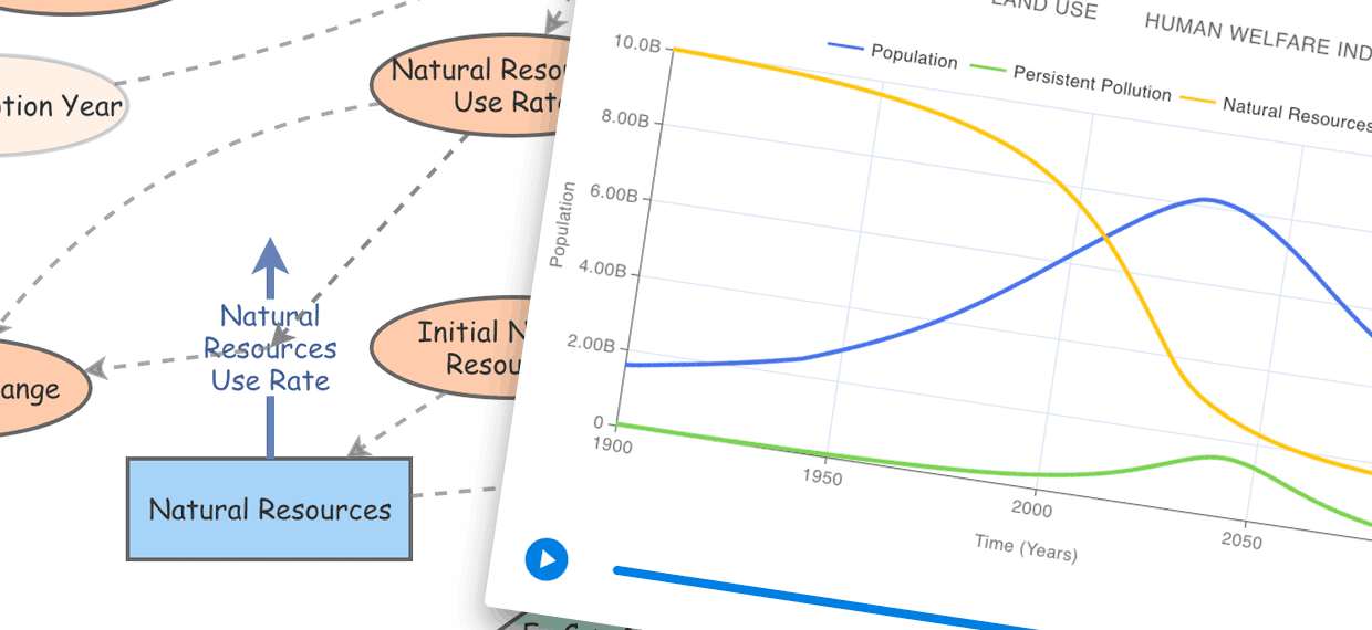
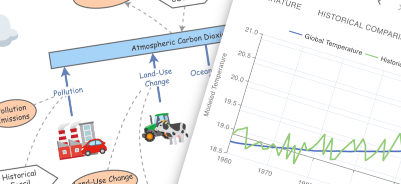
System Dynamics is a powerful approach for modeling change within systems and Insight Maker is perfect for building System Dynamics models.
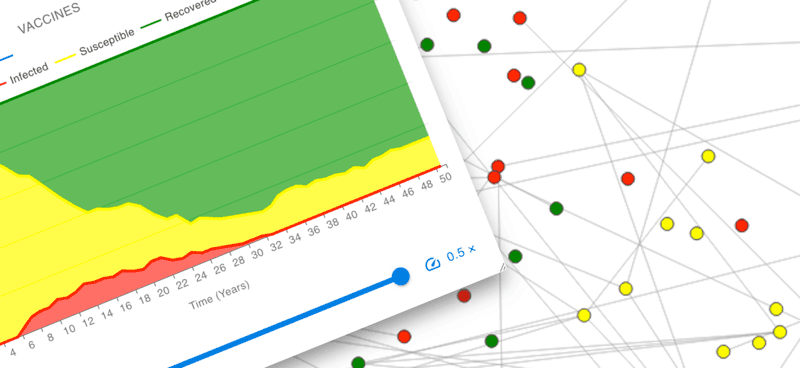
Explore the interactions between dynamic agents. Use Insight Maker to define agent behavior and simulate a population of agents interacting.
Insight Maker runs in your web-browser. No downloads or plugins are needed. Start converting your ideas into your rich pictures, simulation models and Insights now. Features
Explore powerful simulation algorithms for System Dynamics and Agent Based Modeling. Use System Dynamics to gain insights into your system and Agent Based Modeling to dig into the details. Types of Modeling
Sharing models has never been this easy. Send a link, embed in a blog, or collaborate with others. It couldn't be simpler. More
Build your models for free. Share them with others for free. Harness the power of Insight Maker for free. Open code mean security and transparency. More


